DishDash UAE
Multi-brand restaurant marketing site.
A unified digital home for four distinct restaurant brands. One site, four identities, one parent story.
- Role
- Designer + Builder
- Year
- 2026
- Client
- DishDash F&B Group
- Scope
- Marketing site · 4 brands · responsive
- Tools
- Vite · React · TypeScript · Figma · Claude · Cursor
Who they are.
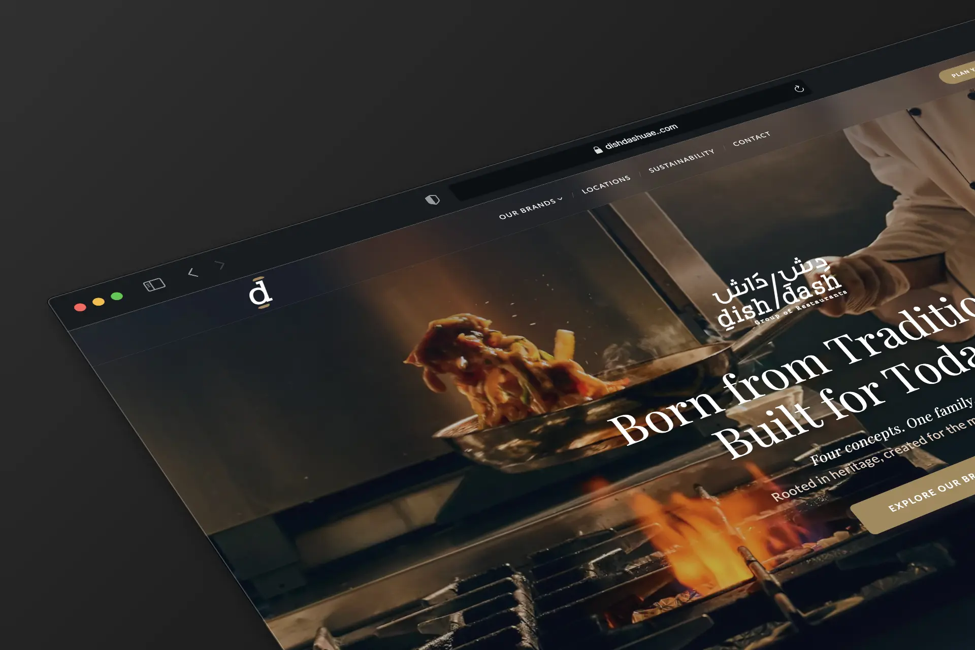
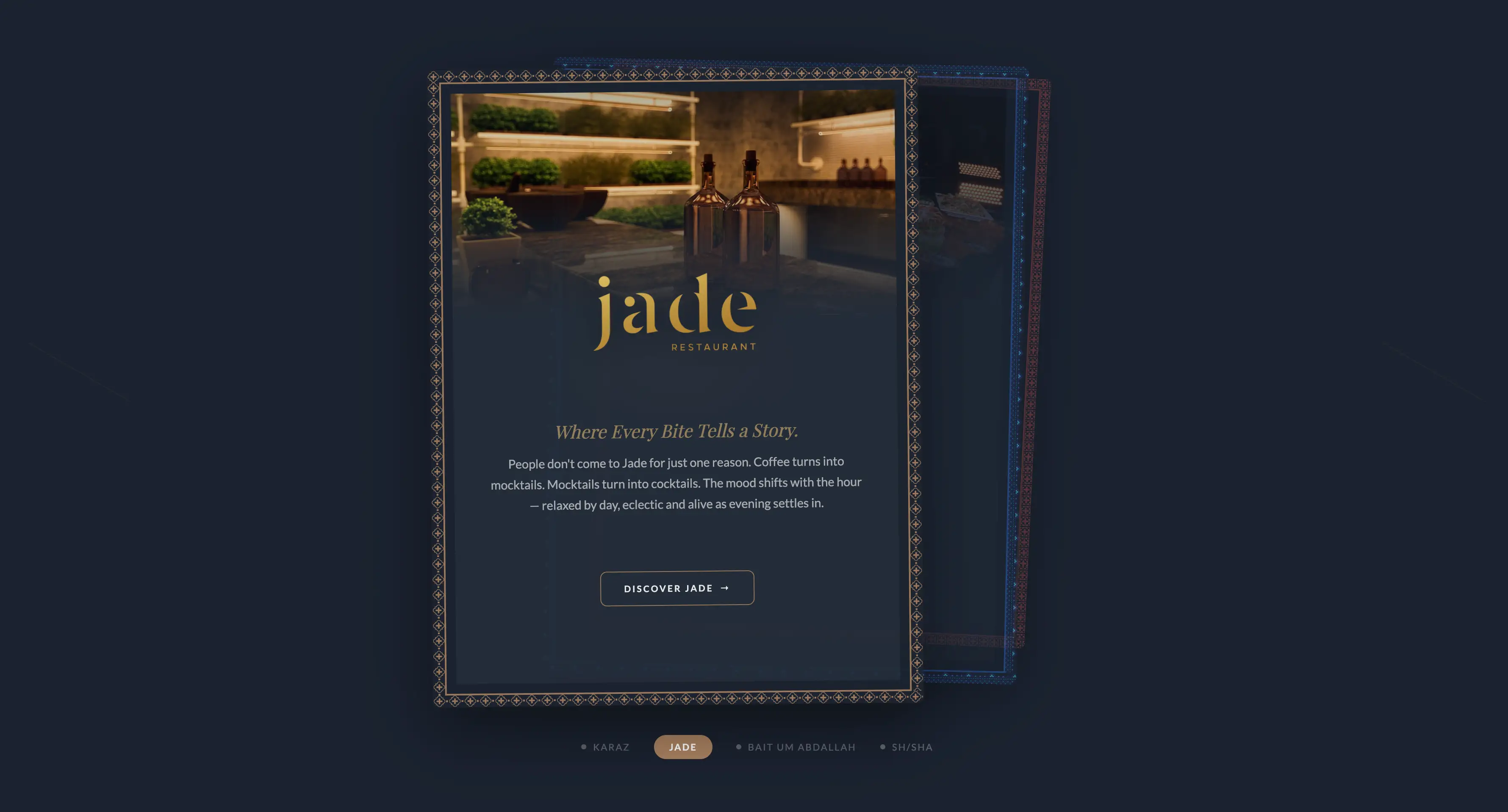
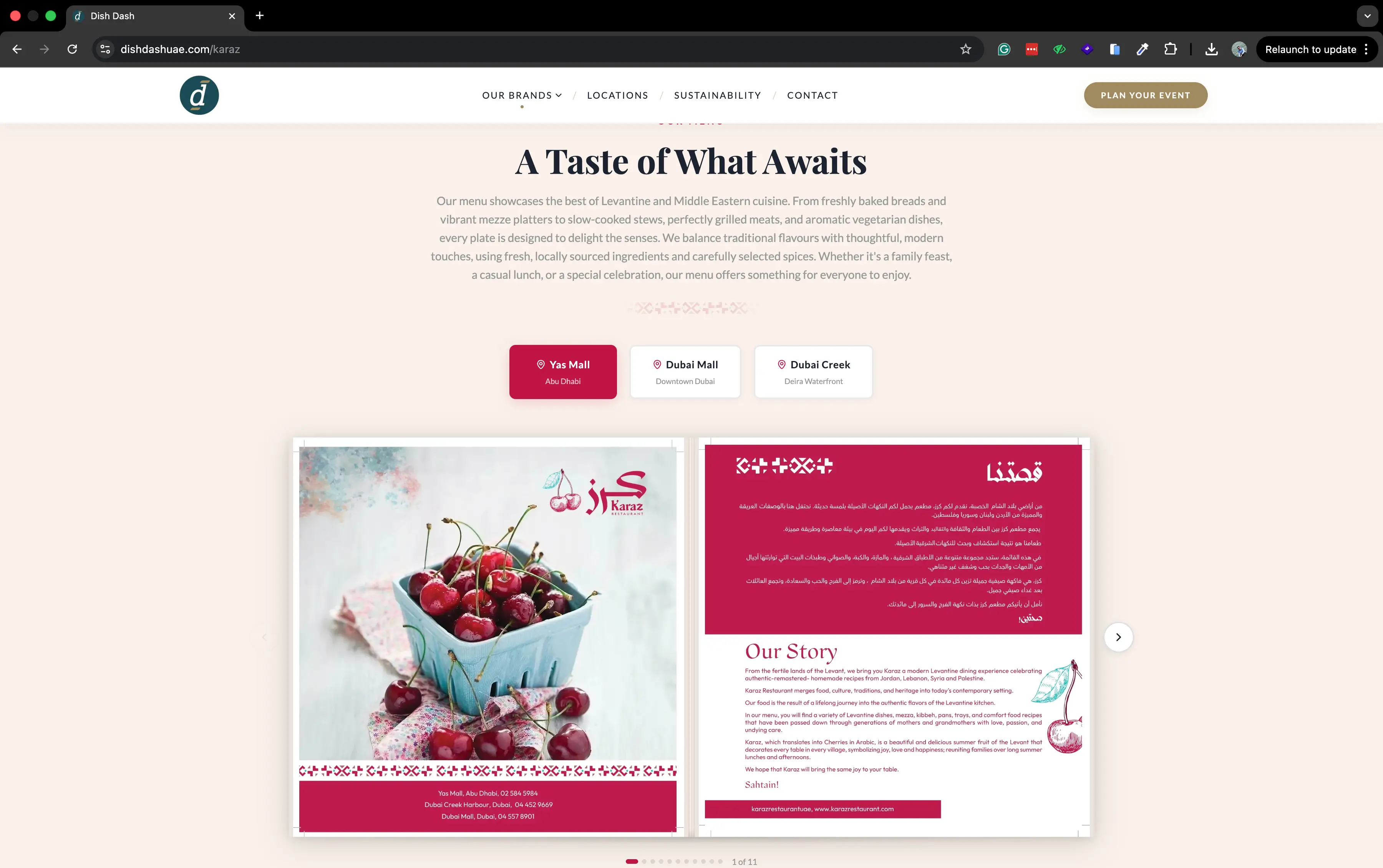
DishDash is a UAE-based F&B group operating four restaurant brands across the Emirates: Karaz, Jade, Bait Um Abdallah, and Sh/sha.
Each brand serves a different cuisine and audience but shares a parent operations team, kitchens, and supply chain. They needed a single digital home that respected the four brand identities while telling the parent group's story.
What needed solving.
Four brands, four social presences, no central web home. Customers discovering one brand had no way to find the others. Recruiters, partners, and franchise inquiries had no canonical destination.
Each brand had its own visual language, colour, typography, photography style, and any unified site had to do justice to all of them without flattening their character.
- Single canonical home for the parent group↳ Parent shell with one nav, one footer, one URL space
- Equal visual prominence for each of the four brands↳ 4-up brand selector grid · equal card weight · token-swap on hover
- Per-brand pages that feel native to each brand↳ Per-brand pages reuse the chassis but swap colour, type, and photography rules
- Fast, mobile-first, SEO-tuned↳ AVIF / WebP images, prefetched routes, Lighthouse-tuned, mobile-first grid
- CMS-light: editable copy without dev cycle↳ Copy + sections live in a typed config, non-devs edit JSON-shaped content, ship via PR
Five phases, idea to ship.
- 01✓ doneDiscovery
Brand audits, UAE F&B competitor scan, stakeholder interviews, JTBD framing.
- 02✓ doneInformation Architecture
Parent → sub-brand routing, URL strategy, sitemap, 12 page templates wireframed.
- 03✓ doneVisual Design
Tokenised design system. Per-brand colour, typography, imagery rules slotted into one shell.
- 04✓ doneBuild
Figma → Vite + React + TypeScript. Tailwind tokens mirror Figma. Image pipeline.
- 05● livePolish + Ship
Motion choreography, performance budget, SEO meta, OG cards, analytics, Vercel deploy.
Four brands, one shell.
Shared chassis, swapped soul. Every brand inherits the parent grid, motion language, and component shapes, then overrides colour, typography, and imagery rules to read 100% like itself. Switching brands feels like changing channels, not loading a new site.
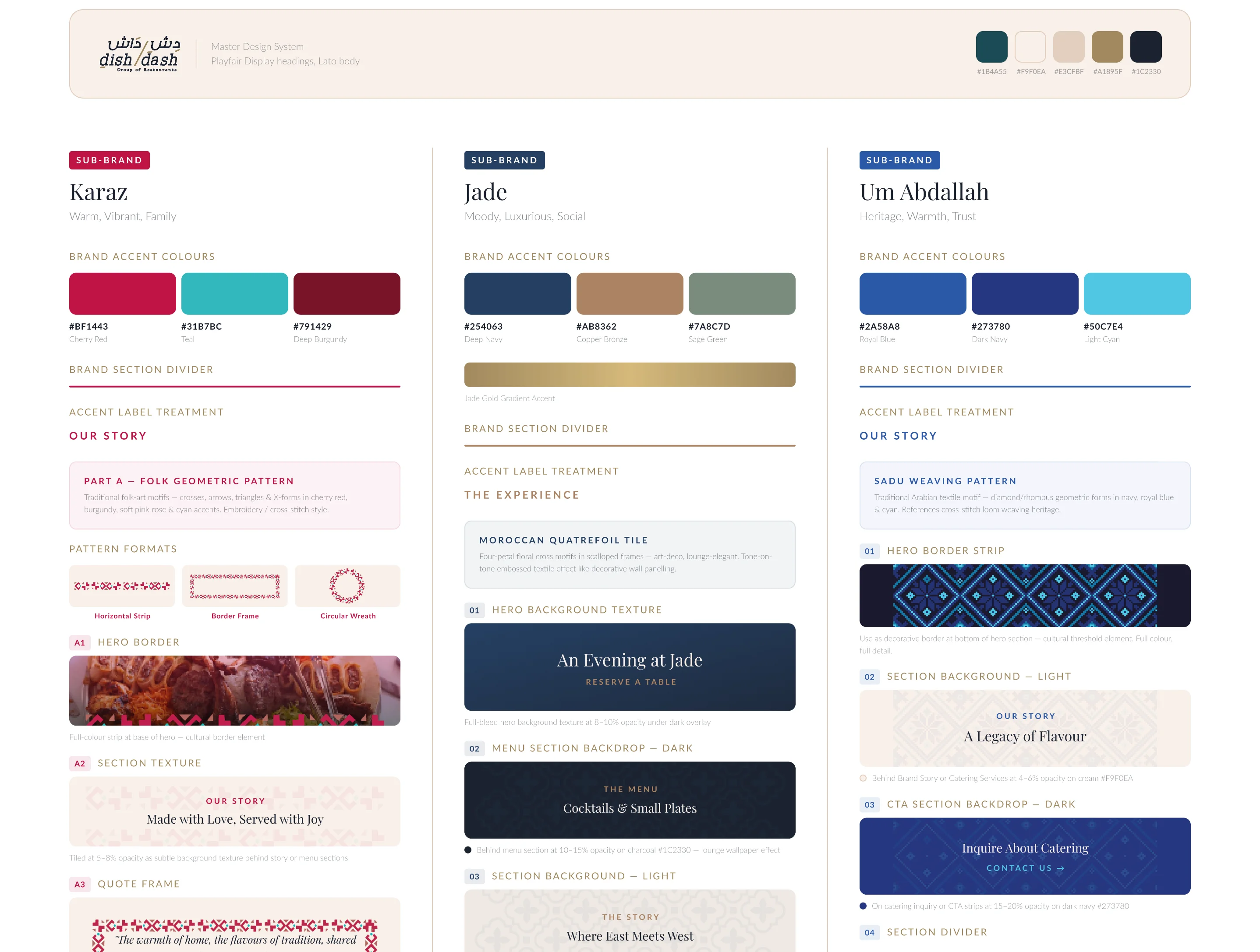
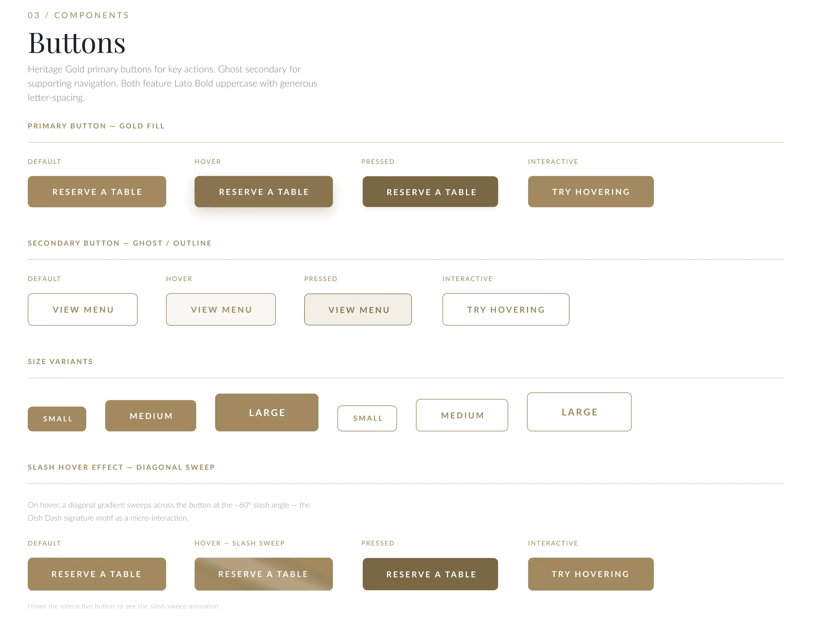
Tokens, not magic numbers.
Tokens live in code, mirror Figma exactly. A single CSS variable swap rethemes a brand. No hard-coded colours, no orphan typography, every component pulls from the token layer.
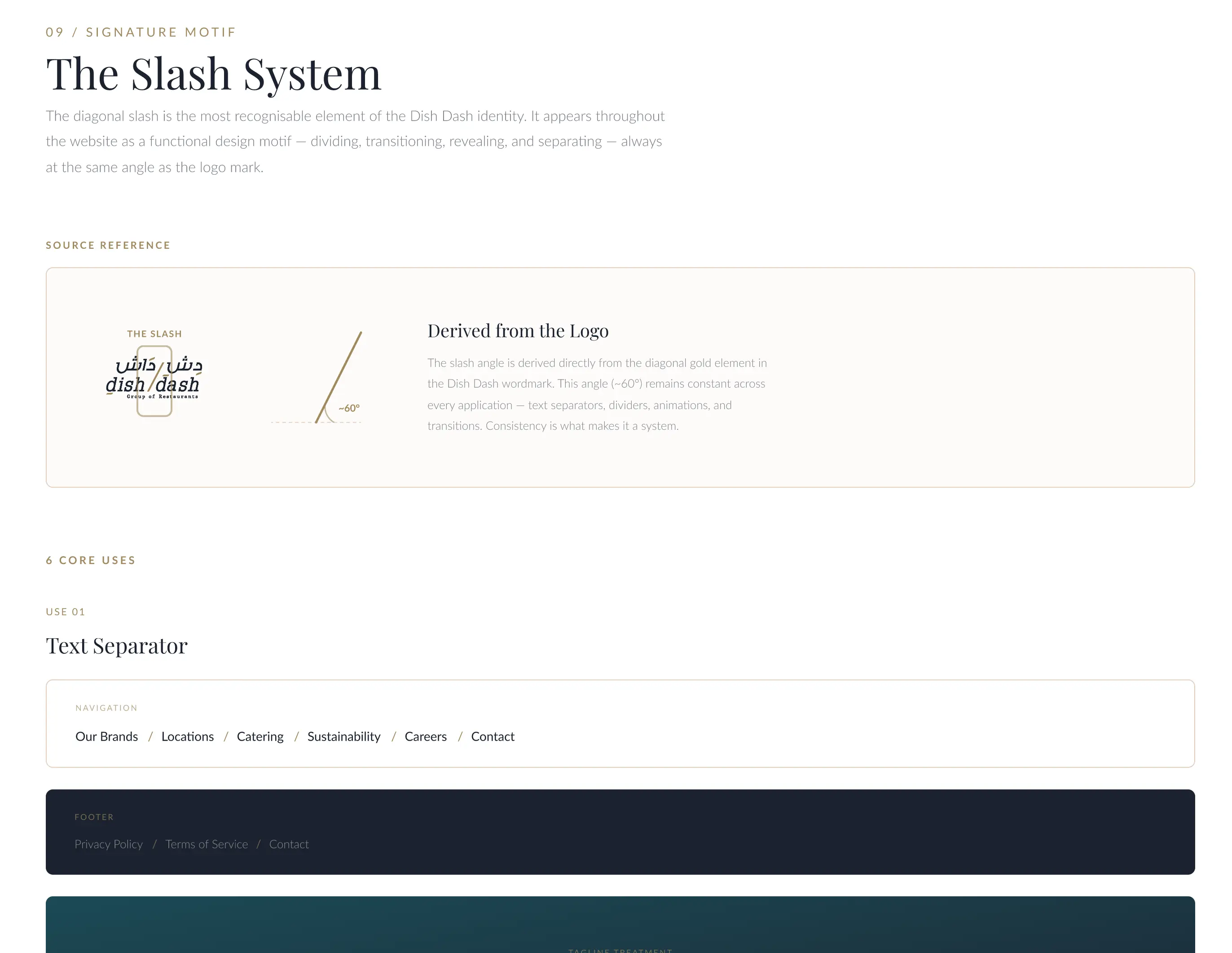
The slash is the seal.
The slash is the family seal. The parent wordmark dish/dash carries it. Sh/sha echoes it. Anywhere you see a slash on the site, you're looking at the DishDash family of brands, even when you've never seen the logo before.
Same chassis. Swapped soul.
One React shell renders all 4 brand pages. The chassis stays identical, only the token layer swaps. Same nav, same scroll rhythm, same motion timing. Different colour, type, photography, and copy voice.
- Nav structure + footer
- 12-column grid + spacing scale
- Component shapes (cards, buttons, inputs)
- Motion timing + ease curves
- Reservation flow
- Colour tokens (4 themes)
- Type pairing (serif ↔ sans ↔ Arabic ↔ mono)
- Photography rules (mood, crop, lighting)
- Copy voice (warm / quick / heritage / late-night)
- Hero motif per brand
The work.
How it moves.
- Brand-card hover lifts + tints with brand accent
- Cross-brand transitions use a shared logo mark that morphs
- Hero scroll: parallax photo + headline split-shift
- Locations map: animated path drawing across Emirates
- Reduced-motion variant respected end-to-end
Under the hood.
- Design
- Figma · FigJam · token-mirrored design system
- AI · Design
- Claude Opus 4.6 (design + code partner)
- AI · Research
- Gemini 3.1 Pro (multimodal · brand audits)
- Framework
- Vite + React + TypeScript
- Styling
- Tailwind v4 (tokens mirror Figma)
- Motion
- Framer-motion + GSAP
- Images
- AVIF / WebP, blurred-up placeholders
- Analytics
- Plausible (cookieless)
- Deploy
- Vercel · auto-preview per PR
What shipped.
- Trust earned · DishDash awarded the Flavours app contract on the back of this work
- Site live at dishdashuae.com, one canonical home replacing fragmented social-only presence
- All four brands ship under one roof, navigable in two clicks
- Editable content without dev intervention
- Mobile-first; 70% of traffic projected on phone
“Finally one place that does justice to all four brands. The site feels like the company felt, premium, cohesive, ready to scale.
Made with.
- Designer + BuilderTaher Badshah ↗
- ClientDishDash F&B Group ↗
- Brand inputsKaraz · Jade · Bait Um Abdallah · Sh/sha brand teams
- PhotographyIn-house F&B shoots
On the roadmap.
- →Online ordering, Flavours app integration
- →Arabic localisation, full RTL pass
- →Per-location landing pages
- →Loyalty programme tie-in once Flavours ships